
Assignment
Kinderergotherapie Spelende Wijzer helps children develop behavioural, self-reliance and school skills. After taking over the company, it was time for the new owner to modernise the logo, corporate identity and website. But with the concrete requirement that their recognisability should not deteriorate.
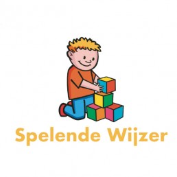
Old
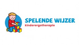
New
Logo APK
For the logo of Spelende Wijzer, we carried out a so-called ‘Logo APK’. This involves focusing mainly on the logo’s use of colour, font and composition. Based on these points, the new logo is optimised so that it can keep up with the times and not fall behind. At Spelende Wijzer, we brought down the amount of different colours until 3 primary colours remained. Namely blue, red and yellow. This combined with a playful font makes a good whole.
Fresh and playful look
By using fresh and cheerful colors, they now appeal to the parent and the child. Spelende Wijzer’s target group is mainly young children, but it is the parents who are ultimately addressed. Adding the circle to the logo immediately created an element that can be extended in various ways in a playful house style.
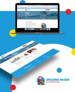
Website
With the new website, the main focus is on user-friendliness (easy to navigate) and tranquility. A number of things are deliberately repeated several times so that parents can easily find their way around the website, while playful elements were used so children can enjoy looking at it.
Also looking that cool?
Modernizing an existing corporate identity does not mean that your recognizability has to be compromised. On the contrary, it can ensure that you attract attention again and hopefully receive compliments. Would you like to know more about what we can do for your company and how we can renew your image? Brandmerk Advertising is ready to help you!